Pythonで積上げ棒グラフを描く ― 発展編

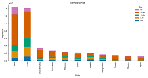
前回Pandasの機能を使って国別・年齢層別の積上げ棒グラフを作りました。
Pythonで積上げ棒グラフを描く ― 基礎編
仕事のため試行錯誤しながら積上げ棒グラフを作ったので、備忘録としてやり方をまとめておきます。ここではOur World in Dataから入手した国別・年齢層別人口データを用い…


各国データを層化するカテゴリーが年齢という共通なものでありデータ構造が比較的単純だったので有効な方法でしたが、データがより複雑だったり図に属性を表示したかったりすると機能が物足りなくなります。
今回は自動車メーカー・モデル別の売上台数をお題に、前回の発展版として別の方法で積上げ棒グラフを作成します。外部ライブラリのインストールがまだなら
conda install requests pandas matplotlib seaborn -yまたは
pip install requests pandas matplotlib seaborn -yと打ってインストールしておきます。次に、goodcarbadcar.netというサイトから表をPandasのdataframeに読み込みます。
import io
import re
import requests

url = 'https://www.goodcarbadcar.net/2023-us-vehicle-sales-figures-by-model/'
content = requests.get(url).content
tables = pd.read_html(io.StringIO(content.decode('utf-8')))
sales = (tables[0]
         .assign(Brand=lambda df: df.Model.str.split(n=1, expand=True)[0],
                 Model=lambda df: df.Model.str.split(n=1, expand=True)[1]
                 .replace('3', 'Mazda 3'))
         [['Brand', 'Model', 'YTD']]
         .dropna()
         .astype({'YTD': 'int'})
         )
sales.head()| Brand | Model | YTD |
|---|---|---|
| Mazda | Mazda 3 | 15157 |
| Toyota | 4Runner | 57020 |
| Volvo | 60-Series | 8788 |
| Volvo | 90-Series | 697 |
| Honda | Accord | 68124 |
リンク切れの場合は当ブログのローカルファイルを読み込んでください。
url = 'https://abittechnical.work/wp-content/uploads/2024/06/vehicle_sales.csv'
content = requests.get(url).content
sales = pd.read_csv(io.StringIO(content.decode('utf-8')))
ブランド別売上台数 YTD (year to date) のランキングを求めます。
ranking_by_brand = (sales
                    .groupby('Brand')
                    .YTD
                    .sum()
                    .sort_values(ascending=False)
                    )
グラフの見栄えを設定します。
from matplotlib import pyplot as plt
from matplotlib import rcParams

rcParams.update(
    {
        "axes.spines.top": False,
        "axes.spines.right": False,
        "axes.formatter.use_mathtext": True,
        "axes.formatter.limits": [-3, 3],
        "lines.linewidth": 1,
        "legend.frameon": False,
        "font.size": 11,
        "text.usetex": False,
        "font.family": ["Helvetica Neue", 'DejaVu Sans', "IPAexGothic", "sans-serif"],
        'svg.fonttype': 'none',
    }
)今回はPandasのplot.barメソッドを使いません。Pandasの機能では、ブランドごとに異なる層化カテゴリー(モデル)を表示したり、モデル名をグラフに重ねたりできないからです(もし方法があったらコメントで教えてください)。
代わりにMatplotlibの機能で地道に棒を積上げます。bar_labelメソッドを使い、3万台以上売れたモデルの名を表示しています。
import numpy as np
import pandas as pd
import seaborn as sns
from cycler import cycler

n = 10
threshold = 30_000
width = 0.5
rcParams.update({'axes.prop_cycle': cycler(color=sns.color_palette('bright'))})
fig, ax = plt.subplots(figsize=(12, 6.3))

for i in range(n):
    brand = ranking_by_brand.index[i]
    df = (sales[sales.Brand == brand]
          .sort_values('YTD', ascending=False)
          .set_index('Model')
          [['YTD']]
          )

    bottom = np.zeros(1)
    for model, model_sales in df.iterrows():
        p = ax.bar([brand],
                   model_sales,
                   width=width,
                   bottom=bottom,
                   alpha=.4
                   )
        bottom += model_sales
        if model_sales.values[0] >= threshold:
            name = model
        else:
            name = ''
        ax.bar_label(p, labels=[name], label_type='center')
ax.set_xlabel('Brand')
ax.set_ylabel('Sales volume')
ax.set_title(f'U.S. Vehicle Sales Volumes Ranking: Top {n}')
plt.tight_layout()