Creating Stacked Bar Charts in Python: A Beginner’s Guide

Data visualization is an essential aspect of data science, allowing us to understand complex data sets at a glance. One of the most effective visual tools is the stacked bar chart, which can display multiple data series stacked on top of one another. In this article, we’ll explore how to create stacked bar charts in Python using a practical example.
Preparing the Environment
Before diving into the data, we need to set up our Python environment. This involves installing external libraries such as requests, pandas, matplotlib, and seaborn. These can be installed using either conda or pip, depending on your preference.
Getting Started with the Data
Our journey begins with the acquisition of data. For this tutorial, we’ll use population data by age groups from Our World in Data. This data set provides a comprehensive view of the population distribution across different age brackets. With our environment ready, we proceed to load the data into a Pandas dataframe. This step is crucial as it transforms the raw data into a structured format that we can manipulate and visualize.
import io
import re
import requests

url = 'https://abittechnical.work/wp-content/uploads/2024/06/population-by-age-group.csv'
content = requests.get(url).content
df = pd.read_csv(io.StringIO(content.decode('utf-8')))
df.head()| Entity | Code | Year | Population by broad age group - Sex: all - Age: 65+ - Variant: estimates | Population by broad age group - Sex: all - Age: 25-64 - Variant: estimates | Population by broad age group - Sex: all - Age: 15-24 - Variant: estimates | Population by broad age group - Sex: all - Age: 5-14 - Variant: estimates | Population by broad age group - Sex: all - Age: 0-4 - Variant: estimates |
|---|---|---|---|---|---|---|---|
| Afghanistan | AFG | 1950 | 213022 | 2773093 | 1425494 | 1820573 | 1248282 |
| Afghanistan | AFG | 1951 | 216096 | 2803308 | 1446694 | 1858587 | 1246857 |
| Afghanistan | AFG | 1952 | 219028 | 2834902 | 1468534 | 1896850 | 1248220 |
| Afghanistan | AFG | 1953 | 221925 | 2866392 | 1489850 | 1931657 | 1254725 |
| Afghanistan | AFG | 1954 | 224755 | 2898163 | 1510311 | 1963243 | 1267817 |
Transforming the Data for Visualization
The next step is to prepare the data specifically for our stacked bar chart. We remove duplicates to ensure we’re working with the latest data and sort the countries by total population in descending order.
population = (df
              [~df.Code.isin(['OWID_WRL', np.nan])]
              .drop_duplicates(subset='Code', keep='last')
              .rename(columns={col: re.search(r'Age: (\S+) - Variant', col).groups()[0]
                               for col in df.columns[3:]})
              .assign(total=lambda df: df.loc[:, '65+':].sum(axis=1))
              .sort_values('total', ascending=False)
              .reset_index(drop=True)
              )
Customizing the Chart’s Appearance
Aesthetics play a significant role in data visualization. We customize the look and feel of our chart by setting various parameters in matplotlib and seaborn. This includes adjusting the axes, lines, fonts, and more to make our chart both informative and visually appealing.
from matplotlib import pyplot as plt
from matplotlib import rcParams

rcParams.update(
    {
        "axes.spines.top": False,
        "axes.spines.right": False,
        "axes.formatter.use_mathtext": True,
        "axes.formatter.limits": [-3, 3],
        "lines.linewidth": 1,
        "legend.frameon": False,
        "font.size": 11,
        "text.usetex": False,
        "font.family": ["Helvetica Neue", 'DejaVu Sans', "IPAexGothic", "sans-serif"],
        'svg.fonttype': 'none',
    }
)
Visualizing the Data
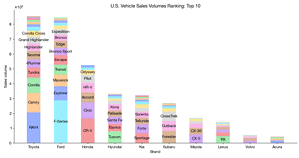
Finally, we use Pandas’ plot.bar method to create our stacked bar chart. We focus on the top 10 countries by population and display the distribution across different age groups.
import numpy as np
import pandas as pd
import seaborn as sns

n = 10
fig, ax = plt.subplots(figsize=(12, 6.3))
population.loc[:n].plot.bar(ax=ax,
                            x=0, y=range(7, 2, -1),
                            stacked=True,
                            color=sns.color_palette('colorblind'))
ax.legend(reverse=True, title='Age')
ax.set_ylabel('Population')
ax.set_title('Demographics')
plt.tight_layout()
Conclusion
Stacked bar charts are a powerful tool for data scientists. By following the steps outlined in this article, you can create your own charts to visualize complex data sets effectively.
In the upcoming article, we’ll explore more advanced applications of stacked bar charts. Stay tuned for exciting techniques and practical examples that go beyond the basics.
Stacked Bar Chart in Python - Advanced
In this advanced tutorial, we delve deeper into the art of creating stacked bar charts using Python. Building upon our previous basic tutorial, we explore more…